Prototype and Wireframes for PhotoStacks
Interaction Design / UX Design / UI Design
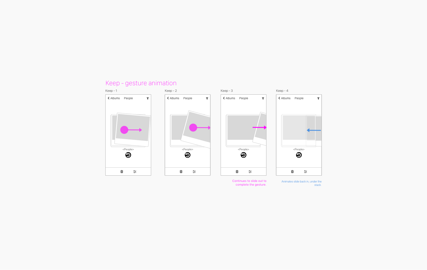
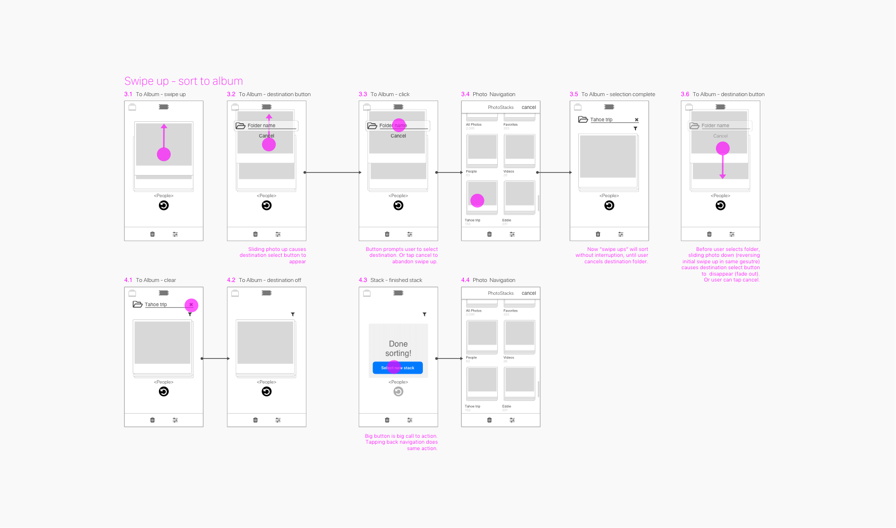
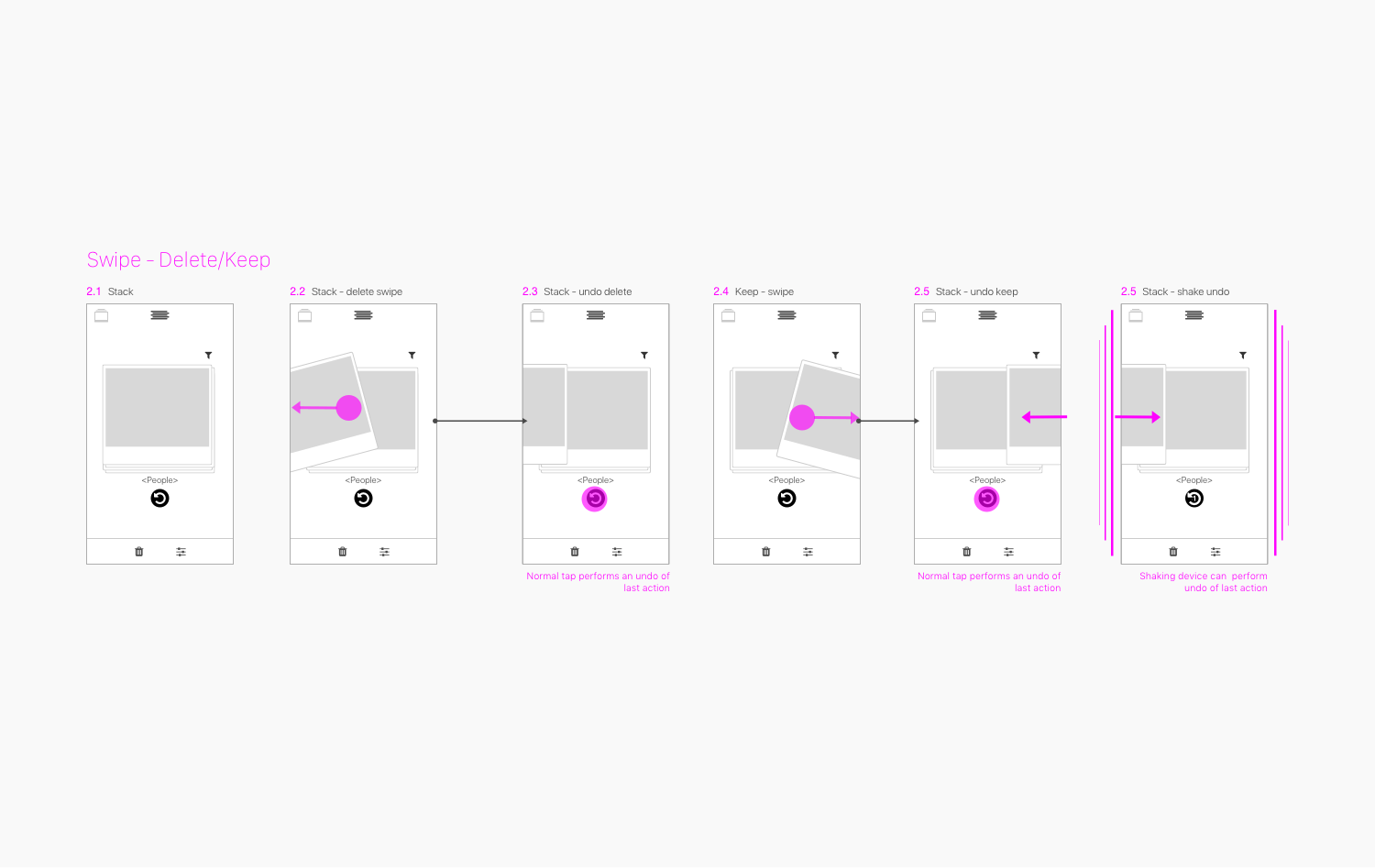
Prototype - Swipe action gesture
The problem with sorting through large numbers of photos on your phone is that it’s tedious and difficult to view photos so you can decide what you want to do with it. I designed PhotoStacks’ UX to work with larger photos using a set of gestures that lets you move, delete, or keep your photos.
Wireframe Of Basic Gestures
PhotoStacks for iOS does not have many buttons in the UI because it relies on gestures for its core functionality. This meant that I had to create detailed wireframes to help visualize how the app functioned. Gestures as a central UX was an interesting contrast to other apps that I have designed.
Wireframe First
The main question I had to answer was, “can many photos be managed with just a few simple gestures?” To help solve this, I thought it was important to visually explore how gestures could be functional in low-fidelity wireframes. After I had a simple solution, I could go back and create and working high(er) fidelity prototype.
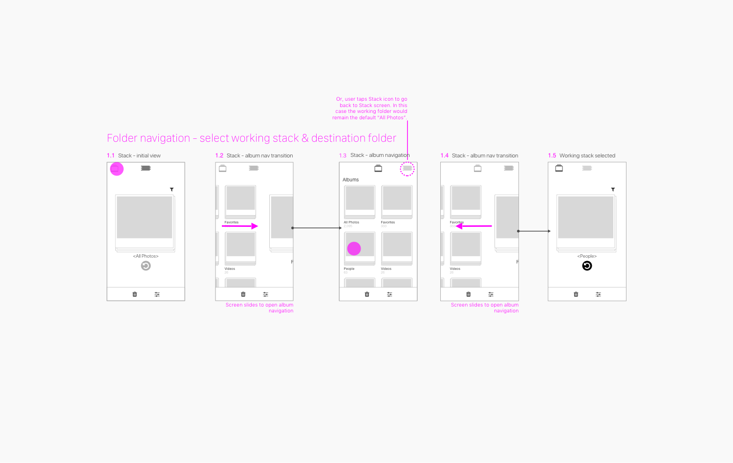
Basic Navigation Wireframes
The goal for the MVP version of this app was to keep the main functionality in front of the user. To achieve this I designed the Stack screen and the storage UI to be at the same level. It’s basically a top navigation tab system. The result was a simple way to navigate from the activity screen to the folder and filter screens and kept them nicely in the same organizational context.
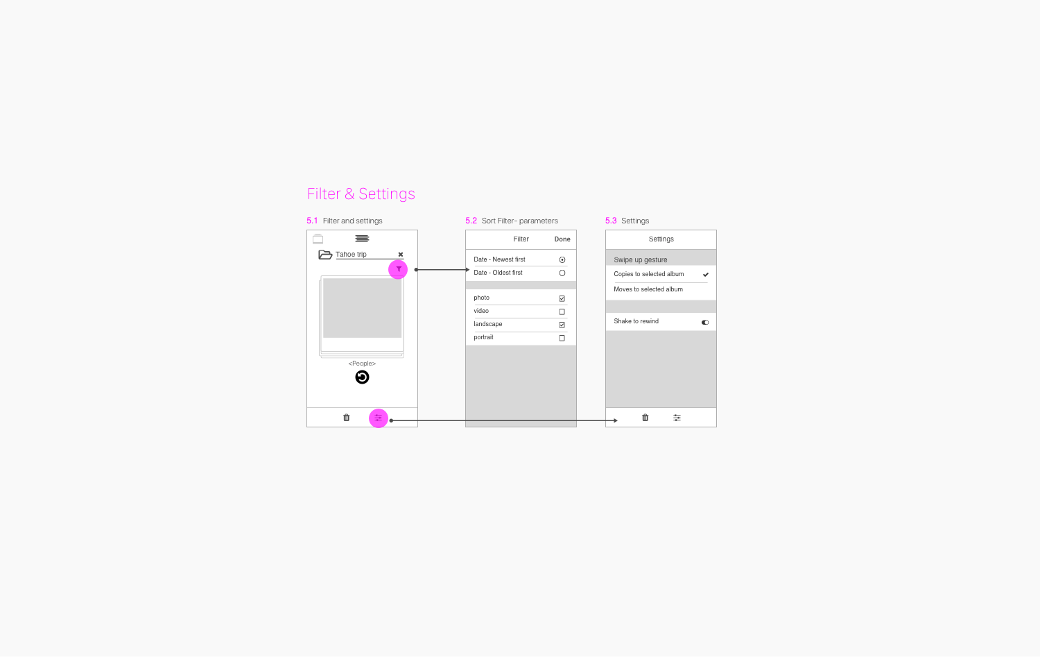
My initial goal was to make Filter and Settings discrete screens, as in the wireframe below. However, after a little real user testing, we found that Filter was used quite often, while Settings was not. With this insight, I elevated the Filter screen to a more prominent tab item, but I buried Settings into the filter screen.
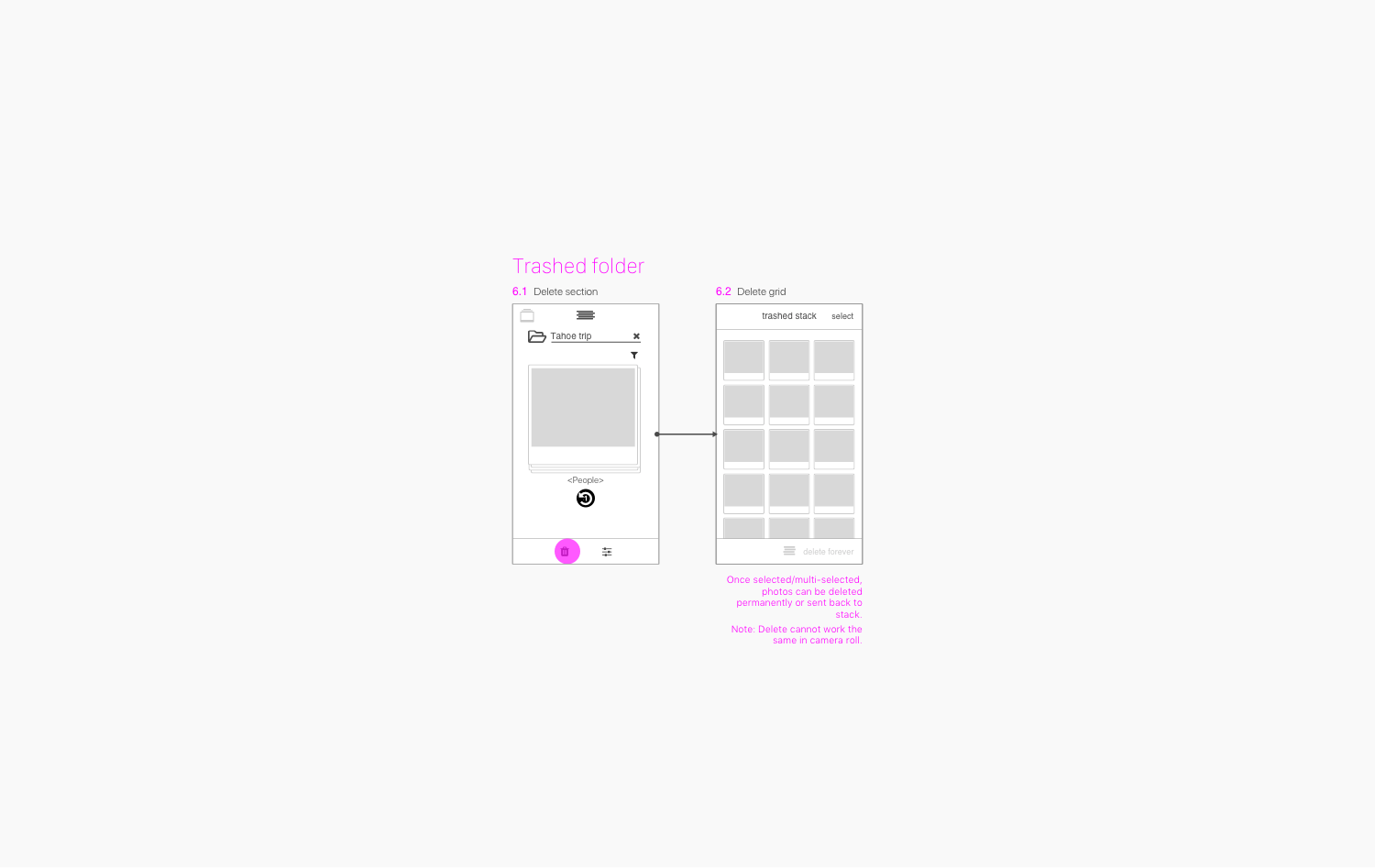
I designed Trash to be a familiar user experience concept so people would feel comfortable about how deleting photos would behave. I also designed some extra safety measure so there would be less regret over mistakenly deleted photos.