Podcast Guru Mobile App
Product Design / UX Design / UI Design / Branding
Designing A Simpler Podcast Listening Experience
The problem with podcast apps is that their screens are cluttered with too many features. Users just want to listen to and manage their episodes without wading through a mass of icons! My solution was to design a simpler podcast app with features centered around the user’s immediate needs. The result is a podcast player with the right features for every function on the right screen, and that has a loyal user base that has grown exponentially year over year.

UX + UI Design
Podcast app users want podcast content
It seems obvious to write in black and white, but the basic problem Podcast Guru had to solve was how to help users subscribe and start listening to their content in 30 seconds or less. If I could design a podcast app that by-passed extraneous features and let users enjoy their content quickly, I and my team knew we would have a competitive podcast app.
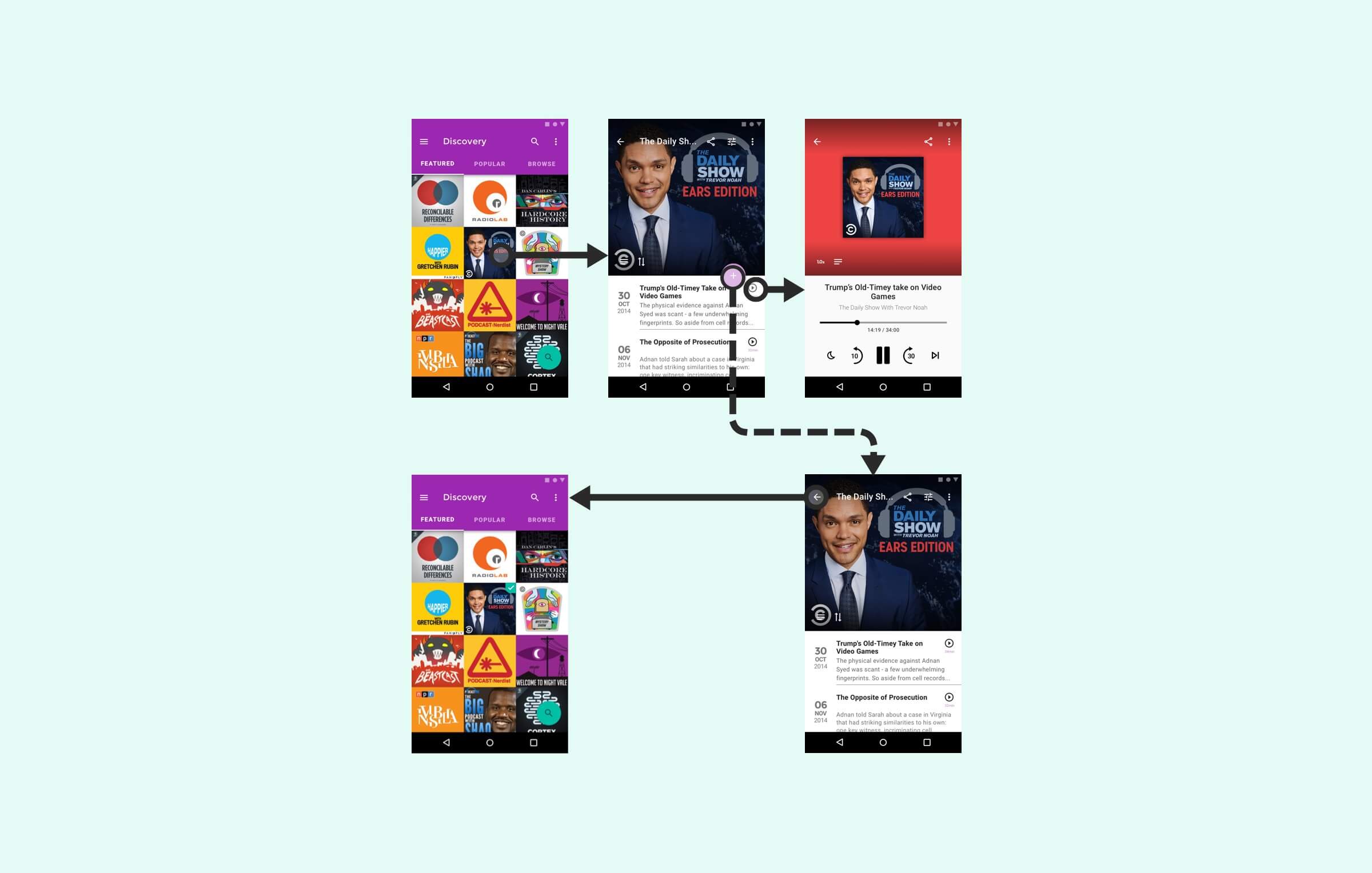
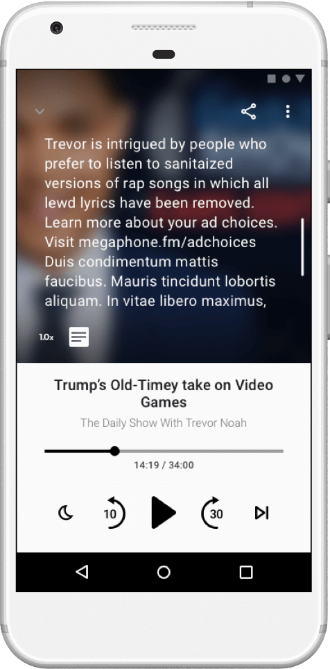
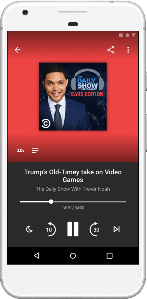
Problem - It takes too long to play a podcast
I designed a few iterations of first-run subscribe and play flows. They were complicated at first. I eventually simplified the flow down to this viable wireframe that shows a user could subscribe in 3 taps, and play in 4 or 5 taps.

Solution - Let users listen in a few seconds
Based on the exploration in wireframes, I found the solution was to design a simple podcast discovery experience that let the user perform three key actions in a matter seconds: 1. discover a podcast, 2. play a podcast, and 3. subscribe to a podcast.
The First Run Must Add Value
The user’s library is empty on first run, how do users search and subscribe to their first podcast? While I was designing the user’s library, I didn’t presume to know what content they wanted to subscribe to. There are many different categories, etc. So, I didn’t want to design a complex solution to suggest content which may not be universally interesting.
Problem - It’s complicated finding “good” podcasts
The user’s library is empty on first run, how do users search and subscribe to their first podcast? How do we solve it simply?
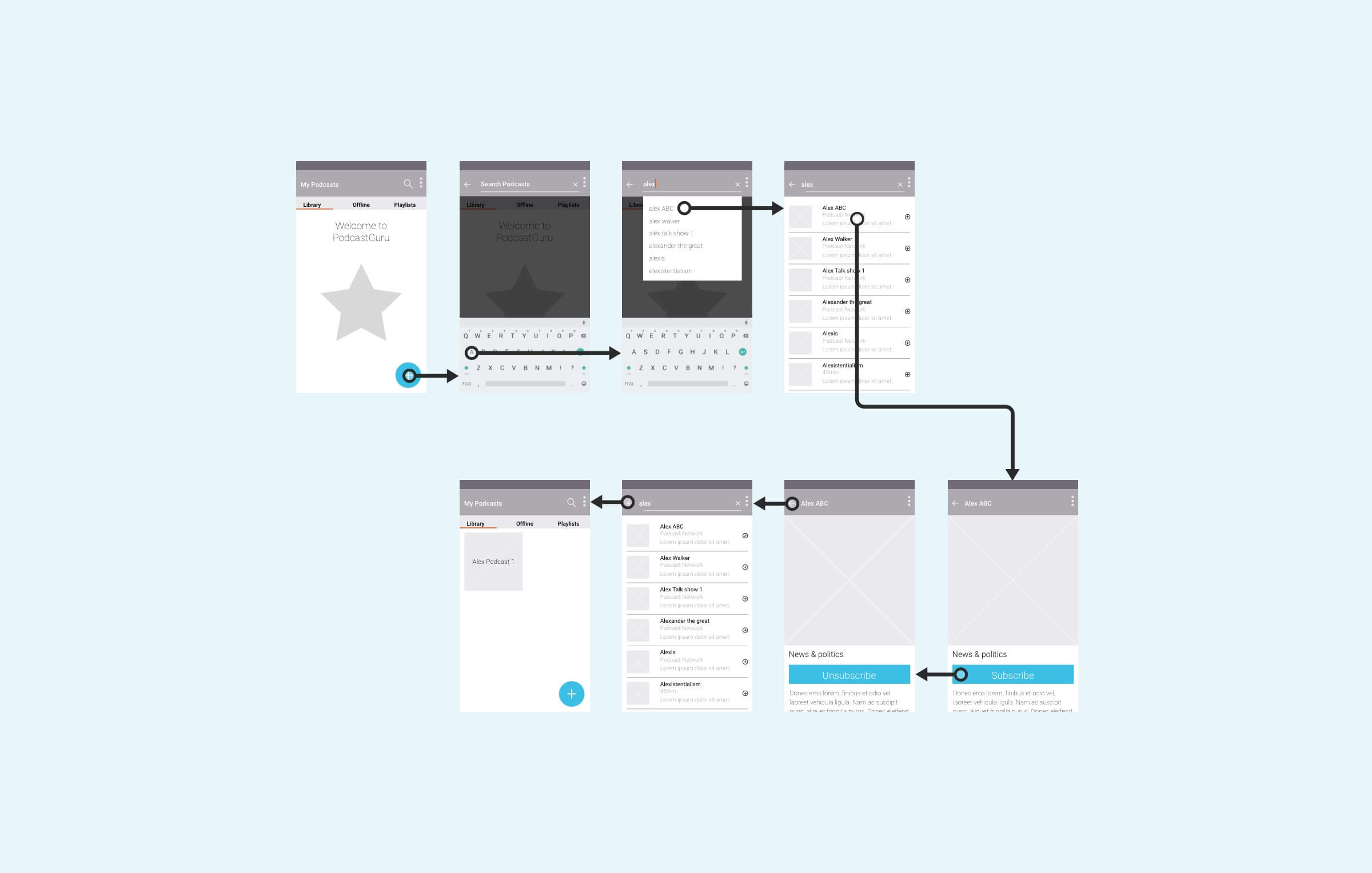
Solution - Search is simple and known, use it.
I decided the leanest way to help users find their content was to design a short call-to-action to “Search.” This allowed the team to roll out a simple feature for users to fill up their library, while we got user-data that helped me design improvements and additional ways to discover and subscribe.

Information Architecture
Screen Flow

UI Design
I designed the UI leveraging off of Material Design. I found that it’s fast and lean to work with an existing design system because Google’s designers solved many problems for me. It’s so well spec’ed, that it allowed me to work focus more on designing the app’s functionality, visual design, and the UI design, rather than reinventing the wheel for UI basics.


Visual Language
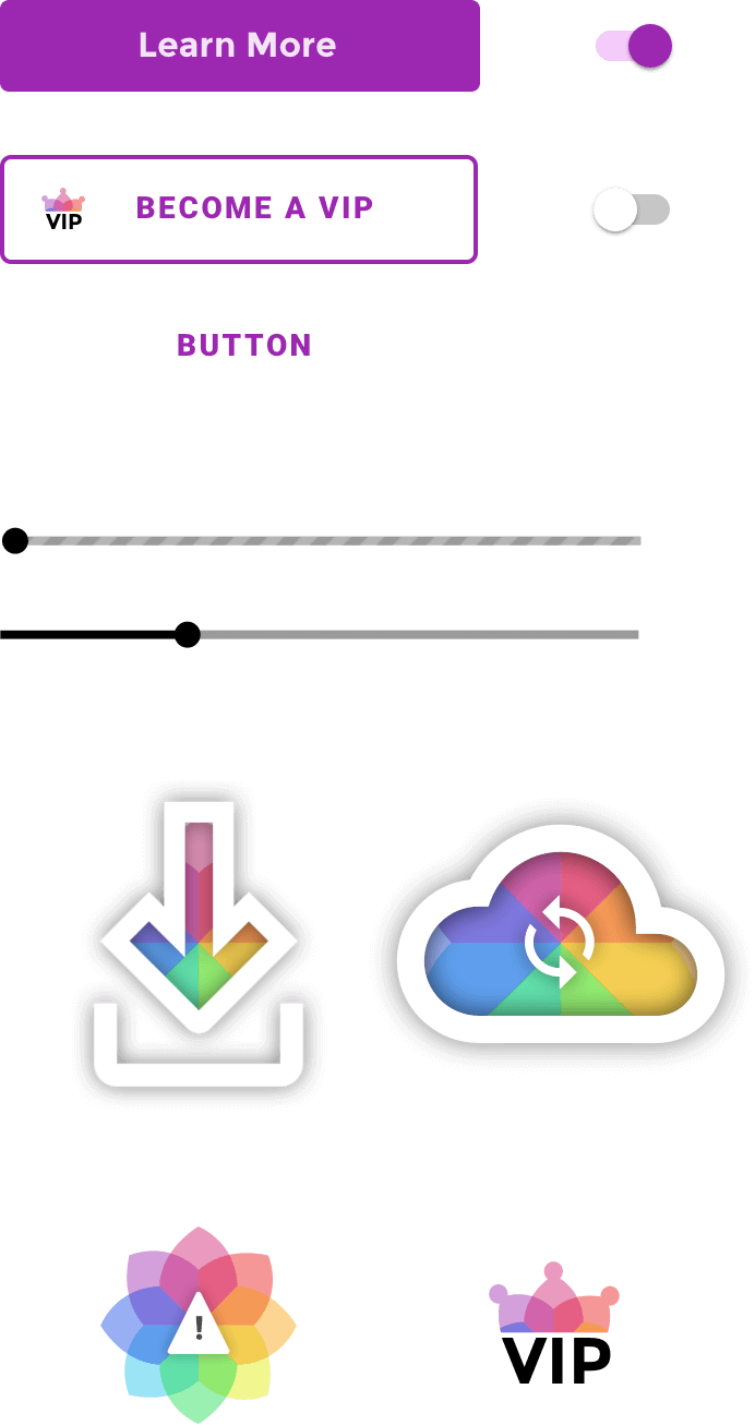
Design Library
My goal was to create a visual design language that was as consistent, unique and memorable at it was scalable to support new features and platforms. I achieved this by designing artifacts and assets that leverage the app’s branding. Material Design is a great resource as a guide to help layout an Android app, but I took the app’s design in a distinctive direction. I designed many custom icons, and created many specifically modified UI elements for Podcast Guru.

Branding
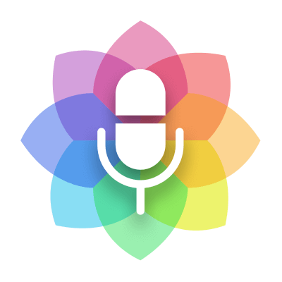
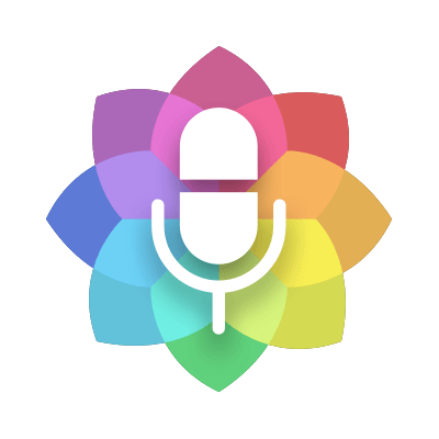
When I designed the Podcast Guru branding, my goal was to express simplicity, bounty, and inclusiveness in one simple mark. Its lotus flower mark signifies enlightened design and simple functionality. Its microphone symbol floats on lotus petals that represent the myriad of podcast content. Its colors are a reflection of the diversity of people and their vast variety of tastes. Its approachability is inline with the fact that the app is free of ads and free of charge.


Color
Brand Colors

Alternative Colors

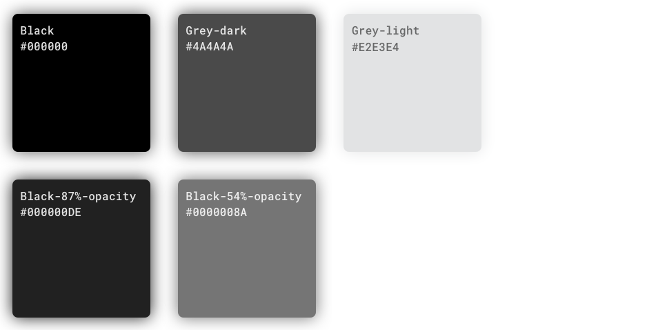
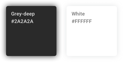
Greys
Background colors
Typography
